6 steps to create a stylish online store

6 steps to create a stylish online store
6 tips to create stylish webdesign

Your shopping website is your window to the world, and having one allows you to expand your business beyond your city and even your country. Building a website helps you establish your brand, increase sales, and find new customers.

However, you need to ensure that it is user-friendly. No one likes to enter a physical store that looks outdated and unattractive. The same applies to your online store or shopping website. What impression do you want visitors to have of your brand? What is the plan for the design of your store? Here, we will help you answer these questions.

Here are some steps on how to create a stylish shopping website:

Насоки за стилен онлайн магазин

Avoid adding too many elements

When it comes to designing an online shopping website, simplicity and agility make it effective, and this applies to any website design. If you don’t want to deter potential customers at the first glance of your store, you should avoid adding too many elements. At best, they will only distract attention.

Customers often lose interest in a store not because it lacks what they need but because they get overwhelmed by a visually complex shopping website. Therefore, when choosing a template or building your site, opt for simple and elegant elements.

A clean structure will not overload the site’s loading speed and will reduce the size of the DOM. Keep in mind that it should be under 900 elements to pass the Google test

Pay attention to typography

You might have a fantastic design for your online store, but poor typography. Typography is simply the arrangement of fonts or the presentation of text. The way your store’s fonts look determines how readable the parts of your business information are.

So, choose a legible font style if you don’t want your customers to be disappointed in reading the words on your web pages. Prioritise a legible font type and size over a stylish one that is difficult to read.

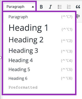
Be mindful of structure!

Maintain hierarchy when arranging text and headings. Avoid writing long columns of text; they are hard to read, and users tend to skip them.

On-page SEO example structure of the titles

Choose your colour palette wisely

Undoubtedly, colours contribute to the beauty of literally everything, and an online shopping site is certainly no exception. Moreover, they can convey the identity of your brand.

For example, a farm produce store that uses blue as its main brand colour may look unbranded. However, if they use shades of green or brown, you’ll understand that it’s about freshness and nature. That’s how crucial the choice of the right colour palette is. So, when building your shopping site, choose a colour that syncs with your brand.

Also, try to avoid combining too many bright colours on one page, as much as possible. Colours can look dreadful when combined incorrectly.

Avoid low contrast between background and font colours. This is one of Google’s tests for page readability. And I cringe when I see white text on a light pink background… Yes, the site is for children’s products, but that doesn’t mean you make it hard to read and give customers a headache.

Example of a hard-to-read menu…

An example of poor colour matching in website design

Difficult to understand, despite following the brand colours…

Make your online store mobile-friendly

What’s the point of building a site only for desktops? You’ll lose many potential customers who surf the internet solely on their mobile devices. That’s why, when designing your site, it’s important to ensure it looks good on mobile phones and tablets.

80-90% of users use mobile devices. Think in that direction, research the competition, and take the best.

Test on different devices and browsers. You’ll be surprised how different a site can look.

Don’t aim for minimalism; a smaller font may look stylish, and 50% grey may be very beautiful, but try reading it on the go on a sunny day. Difficult, right?

Balance between the beautiful and the usable.


Add navigation

As an online business owner, it’s not enough to have a beautiful shopping site. You also need to make it easy to navigate. Ensure that your navigation menu is visible on all your pages. This will make your visitors’ lives much easier.

A site without a navigation menu is like a city without a map. So, if you don’t want your customers to lose interest in your store, make it easy for them to navigate.

Add arrows, plus signs, or other symbols to indicate that there is more. Don’t sprinkle too many levels and subcategories.

Invest in quality images

Images play a crucial role if you want to build an elegant and stylish shopping website. However, don’t just use any images. Use high-resolution images with minimal sizes. Using low-quality images can create a negative impression for your entire store, and those with large sizes may hinder your website’s performance.

These guidelines are basic and only form the framework of how to best create an online store, but they lay the foundation for good sales.

  • Don’t overdo the colours!
  • Don’t exaggerate with fonts and sizes
  • Don’t overdo the animation and effects!
  • Be stylish, not flashy!
Victoria Pencheva
About the author
Facebook
LinkedIn
Pinterest
Skype
WhatsApp
Email
0 0 votes
Article Rating
Subscribe
Notify of
guest
0 Comments
Inline Feedbacks
View all comments

Similar articles

0
Would love your thoughts, please comment.x
()
x
Call Now Button