Web design for websites and online stores

Do you need a website? Today, it is unthinkable to develop a brand without a digital presence. The first step is precisely building a well-functioning and optimised website. Our specialists have 10+ years of experience in web design. Scroll down and take advantage of a free consultation.

Website webdesign

As a digital marketing company, we have developed dozens of websites with various purposes. Each one is approached individually and according to the set goals.

Today, it is absolutely essential to build a responsive web design – a website whose functionality and layout are adapted for both desktop and mobile versions. Our team creates fully customised websites with a clear concept, thoughtful process, and easy communication between the client and specialists.

What is web design?

The process of designing and developing a website includes planning, concept creation, and content structuring to be presented online. Nowadays, web design encompasses not only good aesthetics but also the full functionality of the site. It covers the design and layout of user interfaces, web applications, and mobile applications. 

The quality structure and design of a website can have a significant impact on your presentation in search engines like Google.

Web design - the process

Analysis and goals of the website

The development of a website or an online store starts with the idea and its goals.

  • Whether it will be for services or product sales.
  • Whether it will be B2C or B2B.
  • The volume of pages and products will guide us in choosing the platform for website development.
  • Whether it will target local or international business.
  • Will there be different offerings for different user groups.
  • Identifying the target audience – gender, age, professions.

The process of designing a website starts with a conversation with you about your goals, vision, and preferences. Analysing this information, we present our proposal tailored to the latest requirements and trends in web design. You will receive a project based on which we will create the design and develop your website.

Purpose of the website

The foundation of web design is the purpose of the website. We can categorise them into brochure websites, service-oriented websites, online stores, and media websites.

Each website’s development relies on different principles that impact the design.

Brochure websites: These are usually personal blogs, websites of artists, photographers, doctors, explorers, etc. When creating websites of this type, the emphasis is on attractiveness and a visually appealing design that conveys a specific message. Information is often presented through blog articles.

Example web design of a website type brochure

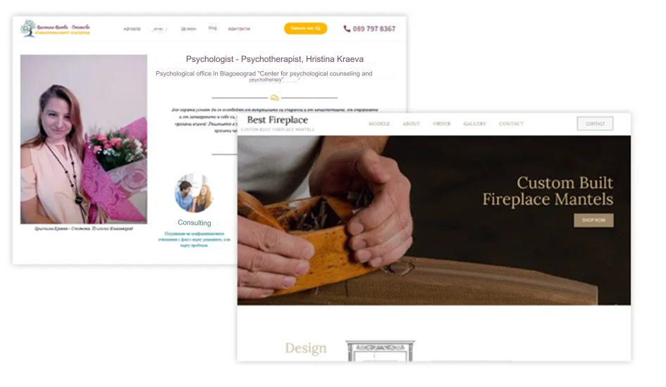
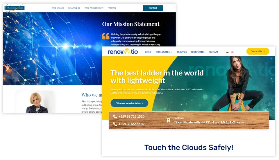
Corporate and service-oriented websites: This type of websites typically consists of a medium-sized number of pages and offers a specific range of services or activities in a niche industry. Examples include websites for construction companies, cleaning services, restaurants, transportation companies, and similar businesses. When creating websites of this type, web design is based on the structure of the services offered. They include articles showcasing completed projects, providing extensive and related information about materials, work processes, applications, and other relevant details.

Example webdesign of site for services.

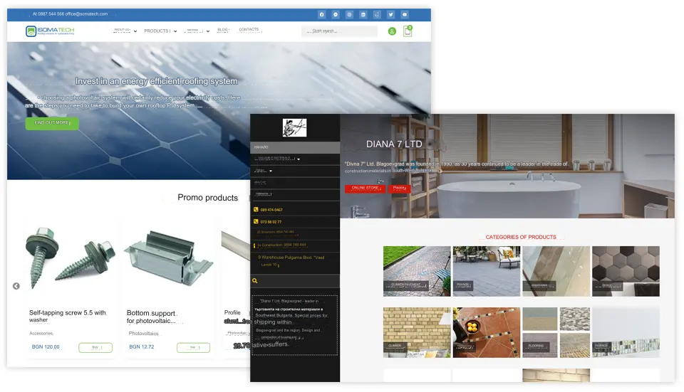
Online store: When creating online stores, functionality is sought after. These websites have a large volume of products and are accessed through mobile devices at a rate of 90-95%. Technical optimisation for achieving good speed and functionality during development is crucial. SEO for online stores is specific and requires a completely different approach. The web design of online stores is clean, with a simple structure, and focuses more on functionality and increasing sales rather than heavy and elaborate design.

Example web design of online store.

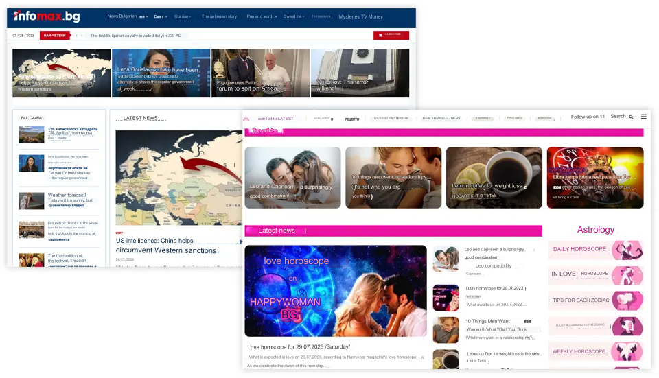
Media websites: Similar to online stores, media websites have a large volume of articles and require daily updates. When creating a media website, we strive for timeliness, and the structure is modified based on the site’s key topics. Web design and development are oriented towards rapid indexing of new articles, daily updates of core information (news, horoscopes), and enrichment with perpetually relevant topics (traditions, customs, historical facts).

Example web design of media.

Web design tools

There are two ways to create a web design. Computer programs or website builders (online site builders) can be used. Depending on the purpose, budget, type of website, and requirements, one or both methods can be used for web design preparation.

The most popular computer programs for web design are Photoshop and Figma.

Through these programs, we create the web design and deliver it to the developers for website or online store development.

Website builders are widely used and preferred. These are CMS platforms like WordPress, Prestashop, Magento, Wix, Shopify, and others. They offer ready-made themes, modules, and plugins. Even without expert knowledge, you could create a website and design your web layout. They are designed to offer responsive design for both desktop and mobile versions.

Analysis and goals of the website

When designing a website, it is important to consider both the visual appearance and the functionality of the site. Integrating these elements will maximise the overall usability and performance of the website. Usability of your site includes elements such as an easy-to-navigate interface, appropriate use of graphics and images, well-written and well-organised text, and a colour scheme that complements the design. The effectiveness of your website refers to its speed, ranking, searchability, and its ability to attract your audience.

  • Text:
    This is the primary element through which you communicate with your users. The layout and structure are essential for keeping the visitor engaged. It should be organised into blocks with a clear and easily readable structure.
  • Fonts:
    Fonts should complement the design and correspond with the colour scheme, images, infographics, and tables to enhance the overall appearance of the site.
  • Colours:
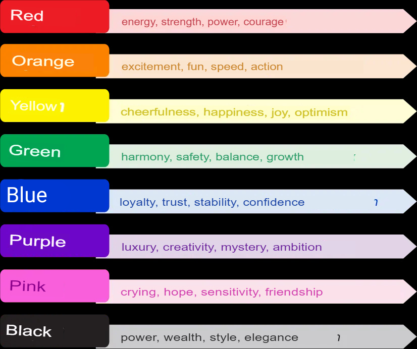
    Colours are one of the most important elements in web design. They convey different messages, and the choice of colours sets the tone for user perception.

Colour psychology of a website design

  • Design:
    The layout of content and elements during website development can make it easier for users to navigate. It is not recommended to use overly stimulating designs that might confuse potential clients.
  • Spacing:
    Elements and blocks of information should not be too close to each other. Proper spacing separates them logically and creates clearly readable pages with visually distinct elements.
  • Graphics Elements:
    Images, banners, infographics, icons, etc., should be used judiciously, considering that they convey more information and are easily perceived as messages. A good combination of shapes and colours leads to a better understanding of the information.
  • Videos:
    The integration of videos in web design is becoming increasingly popular among designers. When used appropriately, videos can help users experience or understand a message that cannot be conveyed effectively through text or images. Keep in mind that visitors’ attention will be drawn to moving images, so your videos should not compete with other essential elements.

Functional elements

These functional elements are essential to consider when designing your website. A properly functioning website is crucial for high rankings in search engines and providing the best user experience for your audience.

  • Structure:

    The structure of your website plays a significant role in both user experience (UX) and search engine optimisation (SEO). Users should be able to navigate your website easily. If users get lost while trying to navigate your site, it’s likely that search engine bots might also have difficulty understanding its functionality. Poor navigation can lead to a negative user experience and lower search engine rankings.

  • Menus and navigation:
    Navigation on your website is one of the primary elements that determine whether your website functions properly. Depending on your audience, your navigation can serve multiple purposes: helping first-time visitors discover what your site offers, providing easy access to your pages for returning visitors, and enhancing the overall experience for each user.


  • User interaction:

    Visitors to your website have multiple ways to interact with it based on their devices (scrolling, clicking, inputting, etc.). The best website designs simplify these interactions to give users the feeling that they are in control. Here are some examples:

    • Never play audio or video automatically.
    • Only underline text if it’s a hyperlink.
    • Ensure that all forms are mobile-friendly.
    • Avoid pop-ups.
    • Minimise scrolling.


  • Animated Elements:

    There are many web animation possibilities that can help draw visitors’ attention to your design and improve interaction with your site. For example, adding “like” buttons or forms can keep visitors engaged on your site.

  • Loading Speed:

    Nobody likes a slow website. If a page takes more than a few seconds to load, it can quickly deter visitors or make them leave your site. No matter how beautiful your website is, if it doesn’t load quickly, it won’t perform well in search rankings (i.e., it won’t rank high on Google). There are various ways to improve speed, such as using plugins and modules, cleaning up unnecessary elements, compressing images, and optimising content. Keep your website fast and lightweight during loading.

Adaptive vs Responsive web design

There are various styles of web design (fixed, static, fluid, etc.). However, in today’s mobile-oriented world, there are only two styles of websites that you should use for proper web design: adaptive and responsive.

Adaptive web design

Adaptive web design uses two or more versions of a website that are personalised for specific screen sizes. Adaptive websites can be divided into two main categories based on how the site detects what size to display:

1. Device-based adaptation

When your browser connects to a website, the HTTP request will include a field called “user-agent,” which informs the server about the type of device trying to view the page (e.g., desktop, mobile device, tablet). The adaptive website will know which version to show based on the device trying to access it. Problems may arise if you resize your desktop browser window because the page will continue to display the “desktop version” instead of adapting to the new size.

2. Browser width adaptation

Instead of using the “user-agent,” the website uses media queries (CSS feature that allows the web page to adapt to different screen sizes) and breakpoints (defined width sizes) to switch between versions. So, instead of versions for desktops, tablets, and mobile devices, you will have versions with widths like 1080px, 768px, and 480px. This offers more design flexibility and a better viewing experience since your website will adapt based on the width of the screen.

Responsive web design

Responsive websites use flexible grid layouts based on the percentage each element occupies in its container. For example, if a header element occupies 25% of its container, it will remain at 25% regardless of changes in the screen size. Responsive websites can also use breakpoints to create a customised layout for each screen size. However, unlike adaptive websites that adapt only when reaching a breakpoint, responsive websites constantly change according to the screen size.

From the problem to the solution

In marketing, we understand that every user has a specific problem that needs to be addressed optimally. Our team of experienced designers researches the competitive environment of your business, conducts analysis, and selects all the necessary resources and data to build a tailored strategy specifically for you, applying all our know-how to your advantage.

Our designers don’t just create websites – they deliver a finished product that can bring you returns and profits if managed and utilised strategically. The design of each website is unique, taking into account the trends and peculiarities of the niche in which you operate and considering the characteristics of web design worldwide.

The Moxx Process

We generate ideas and transform them into prototypes that already set the first images of what the website will showcase. Creating the user interface (UI) is associated with designing attractive visual components of the website – ones that will capture users’ attention and keep them engaged on the site.

The testing phase of the web design process is carried out with utmost attention to the developed components and their conceptualisation. When the entire website design is ready, it’s time to ensure that everything functions correctly and as intended.

Only when we are certain that you will receive 101% professionalism, do you take the baton, but we still remain available for any questions and desires for further collaboration. We work on time, without delays, with dedication and understanding. You can witness our professionalism in our rich portfolio.

What do we do for your business?

We work on several aspects that include a range of activities and features. However, in general, our work revolves around the following points:

  • Visual appearance, layout, and content placement on the website pages – we create websites with an attractive visual appearance, well-structured, and containing appropriately placed content.
  • Selection of colours, fonts, and images – we use colours, fonts, and images to ensure high-quality visual representation on the website.
  • Creating a user-friendly website – we focus on creating a website that is easy to use and navigate, tailored to the target audience and brand.
  • Strengthening trust with your target audience – our work on the website helps build and reinforce trust with your target audience.
  • Visual elements based on psychological and behavioural factors – we combine visual elements to stimulate conversions, sales, engagement, and visibility for your business.

Free consultation

Let’s talk about your project: high-level web design that will surprise the competition and impress the users. 

Frequently asked questions about Web design

From our blog

The AIDA formula

The AIDA formula (attention, interest, desire, action). How to use it? With this article, you will learn how to use the AIDA formula. This powerful

Read post
Call Now Button